.NET MAUI SfBadgeView, SfEffectsView 사용하기 - Syncfusion
.NET MAUI SfBadgeView/SfEffectsView 사용하기 - Syncfusion
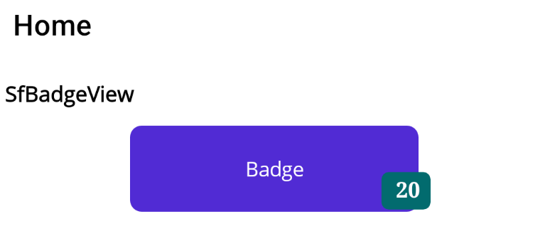
Syncfusion 의 SfBadgeView 컨트롤은 버튼이나 이미지에 벳지 숫자를 표현하고 싶을 때 사용합니다.
먼저 'Syncfusion.Maui.Core' Nuget Package 를 설치합니다.

MauiProgram.cs 에 아래처럼 builder.ConfigureSyncfusionCore(); 코드를 추가합니다.
var builder = MauiApp.CreateBuilder();
builder
	.UseMauiApp<App>()
	.ConfigureFonts(fonts =>
	{
		fonts.AddFont("OpenSans-Regular.ttf", "OpenSansRegular");
		fonts.AddFont("NotoSans-Regular.ttf", "NotoSansRegular");
		fonts.AddFont("NanumBrush.ttf", "NanumBrush");
	});

builder.ConfigureSyncfusionListView();

// SfBadgeView, SfEffectsView
builder.ConfigureSyncfusionCore();
SfBadgeView
xaml 단에서
xmlns:syncfusionCore="clr-namespace:Syncfusion.Maui.Core;assembly=Syncfusion.Maui.Core"
를 정의하고 아래 처럼 사용합니다.
<?xml version="1.0" encoding="utf-8" ?>
<ContentPage x:Class="MauiApp1.SfTestView"
xmlns="http://schemas.microsoft.com/dotnet/2021/maui"
xmlns:x="http://schemas.microsoft.com/winfx/2009/xaml"
xmlns:sys="clr-namespace:System;assembly=netstandard"
xmlns:local="clr-namespace:MauiApp1.Defines"
xmlns:syncfusionCore="clr-namespace:Syncfusion.Maui.Core;assembly=Syncfusion.Maui.Core"
Title="SfTestView"
BackgroundColor="White">
<StackLayout Margin="10">
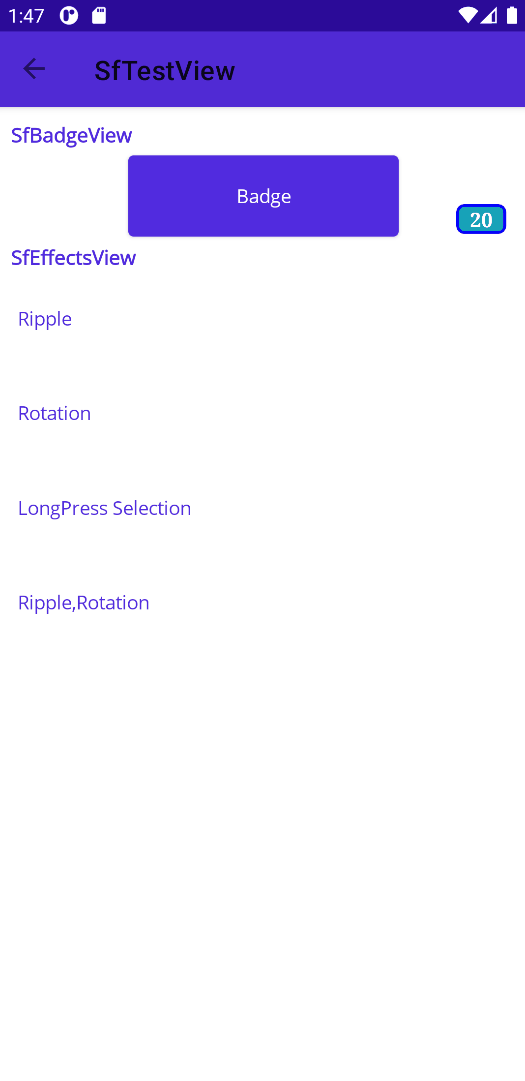
<Label Text ="SfBadgeView" VerticalTextAlignment="Center" FontSize="15" FontAttributes="Bold"/>
<syncfusionCore:SfBadgeView HorizontalOptions="Center" VerticalOptions="Center" BadgeText="20" Margin="5">
<syncfusionCore:SfBadgeView.Content>
<Button Text="Badge" WidthRequest="200" HeightRequest="60" HorizontalOptions="Center"/>
</syncfusionCore:SfBadgeView.Content>
<syncfusionCore:SfBadgeView.BadgeSettings>
<syncfusionCore:BadgeSettings
FontSize="15"
FontAttributes="Bold"
FontFamily="serif"
Stroke="Blue"
BorderWidth="2"
Type="Info"
CornerRadius="5,5,5,5"
Position="BottomRight">
</syncfusionCore:BadgeSettings>
</syncfusionCore:SfBadgeView.BadgeSettings>
</syncfusionCore:SfBadgeView>
</StackLayout>
</ContentPage>
BadgeSettings 에서 Badge 의 폰트 및 외곽선, 코너반지름등을 설정할수 있으며
Position 을 통해 Badge의 위치를 지정할 수 있습니다.
또한 Type 를 통해서 설정값된 Badge Color 를 불러와 사용할수 있습니다.
참고 : https://help.syncfusion.com/maui/badge-view/getting-started
SfEffectsView
Syncfusion 의 SfEffectsView 컨트롤은 항목에 효과를 주고 싶을 때 사용하는 컨트롤입니다.
<?xml version="1.0" encoding="utf-8" ?>
<ContentPage x:Class="MauiApp1.SfTestView"
             xmlns="http://schemas.microsoft.com/dotnet/2021/maui"
             xmlns:x="http://schemas.microsoft.com/winfx/2009/xaml"
             xmlns:sys="clr-namespace:System;assembly=netstandard"
             xmlns:local="clr-namespace:MauiApp1.Defines"
             xmlns:syncfusionCore="clr-namespace:Syncfusion.Maui.Core;assembly=Syncfusion.Maui.Core"
             Title="SfTestView"
             BackgroundColor="White">

    <StackLayout Margin="10">
        <Label Text ="SfBadgeView" VerticalTextAlignment="Center" FontSize="15" FontAttributes="Bold"/>
        <syncfusionCore:SfBadgeView HorizontalOptions="Center" VerticalOptions="Center" BadgeText="20" Margin="5">
            <syncfusionCore:SfBadgeView.Content>
                <Button Text="Badge" WidthRequest="200"  HeightRequest="60" HorizontalOptions="Center"/>
            </syncfusionCore:SfBadgeView.Content>
            <syncfusionCore:SfBadgeView.BadgeSettings>
                <syncfusionCore:BadgeSettings
                    FontSize="15"
                    FontAttributes="Bold"
                    FontFamily="serif"
                    Stroke="Blue"
                    BorderWidth="2"
                    Type="Info"
                    CornerRadius="5,5,5,5"
                    Position="BottomRight">
                </syncfusionCore:BadgeSettings>
            </syncfusionCore:SfBadgeView.BadgeSettings>
        </syncfusionCore:SfBadgeView>

        <Label Text ="SfEffectsView" VerticalTextAlignment="Center" FontSize="15" FontAttributes="Bold"/>
        <syncfusionCore:SfEffectsView
            Margin="5"
            TouchDownEffects="Ripple">
            <Label Text ="Ripple" HeightRequest="60" VerticalTextAlignment="Center"></Label>
        </syncfusionCore:SfEffectsView>

        <syncfusionCore:SfEffectsView
            Margin="5"
            TouchDownEffects="Rotation"
            Angle="180">
            <Label Text ="Rotation" HeightRequest="60" VerticalTextAlignment="Center"></Label>
        </syncfusionCore:SfEffectsView>

        <syncfusionCore:SfEffectsView
            Margin="5"
            LongPressEffects="Selection"
            SelectionBackground="skyblue">
            <Label Text ="LongPress Selection" HeightRequest="60" VerticalTextAlignment="Center"></Label>
        </syncfusionCore:SfEffectsView>

        <syncfusionCore:SfEffectsView
            Margin="5"
            TouchDownEffects="Ripple,Rotation"
            Angle="180">
            <Label Text ="Ripple,Rotation" HeightRequest="60" VerticalTextAlignment="Center"></Label>
        </syncfusionCore:SfEffectsView>
    </StackLayout>
</ContentPage>
아래 이미지를 보면 알 수 있듯이 Label 선택시 효과를 주어 Ripple 로하면 선택시 둥그렇게 커지는 효과가 부여됩니다.
Rotation 은 말그대로 회전되는 것으로 Angle 값에 따라 회전됩니다.
Selection 은 길게 누른 경우 선택되는 효과를 줄수 있으며 TouchDownEffects 에는 여러 효과를 동시에 설정하여 사용할 수 있습니다
소스
https://github.com/kei-soft/MauiApp
GitHub - kei-soft/MauiApp
Contribute to kei-soft/MauiApp development by creating an account on GitHub.
github.com
'코딩 > .NET MAUI' 카테고리의 다른 글
| .NET MAUI CommunityToolkit.Mvvm 사용하기 (0) | 2024.05.04 |
|---|---|
| .NET MAUI File Picker 사용하기 (0) | 2024.05.04 |
| .NET MAUI SfListView Grouping 처리하기 - Syncfusion (0) | 2024.05.02 |
| .NET MAUI SfListView 선택 항목에 대한 디자인 처리하기 - Syncfusion (0) | 2024.05.02 |
| .NET MAUI SfListView 컨트롤 사용하기 - Syncfusion (0) | 2024.05.02 |