WPF Expander 사용하기
2024. 8. 28. 23:50
반응형
WPF Expander 사용하기
Expander는 접을 수 있는 컨테이너로, 공간을 절약하면서도 필요할 때 추가 콘텐츠를 표시할 수 있게 해주는 유용한 컨트롤입니다.
기본적인 사용 방법
<Expander Header="제목을 여기에 입력하세요">
    <StackPanel>
        <TextBlock Text="이것은 확장된 내용입니다."/>
        <Button Content="버튼"/>
    </StackPanel>
</Expander>
접는 영역을 Header 를 이용해 커스텀하게 처리할 수 있습니다.
<Expander Margin="10">
    <Expander.Header>
<DockPanel VerticalAlignment="Stretch">
    <Image Source="/WpfTutorialSamples;component/Images/bullet_green.png" Height="16" DockPanel.Dock="Left" />
    <TextBlock FontStyle="Italic" Foreground="Green">Click to show/hide content...</TextBlock>
</DockPanel>
    </Expander.Header>
    <TextBlock TextWrapping="Wrap" FontSize="18">
    Here we can have text which can be hidden/shown using the built-in functionality of the Expander control.
    </TextBlock>
</Expander>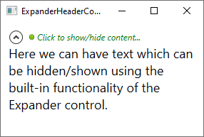
위처럼 처리하면 내용이 많은 경우 스크롤이 생기지 않는데
아래처럼 처리하면 내용이 많은 경우 스크롤 처리가 됩니다.
<Expander Width="200" HorizontalContentAlignment="Stretch">
   <Expander.Header>
     <BulletDecorator>
       <BulletDecorator.Bullet>
         <Image Width="10" Source="images\icon.jpg"/>
       </BulletDecorator.Bullet>
       <TextBlock Margin="20,0,0,0">My Expander</TextBlock>
     </BulletDecorator>
   </Expander.Header>
   <Expander.Content>
     <ScrollViewer Height="50">
       <TextBlock TextWrapping="Wrap">
         Lorem ipsum dolor sit amet, consectetur adipisicing elit,
         sed do eiusmod tempor incididunt ut labore et dolore magna
         aliqua. Ut enim ad minim veniam, quis nostrud exercitation
         ullamco laboris nisi ut aliquip ex ea commodo consequat.
         Duis aute irure dolor in reprehenderit in voluptate velit
         esse cillum dolore eu fugiat nulla pariatur. Excepteur sint
         occaecat cupidatat non proident, sunt in culpa qui officia
         deserunt mollit anim id est laborum.
       </TextBlock>
     </ScrollViewer>
   </Expander.Cont
728x90
반응형
'코딩 > WPF' 카테고리의 다른 글
| WPF BooleanToVisibilityConverter (0) | 2024.09.11 |
|---|---|
| WPF DataTrigger MultiDataTrigger 처리 (0) | 2024.09.11 |
| WPF ListView 내부 버튼 클릭 시 선택한 Item 가져오기 (0) | 2024.08.28 |
| WPF DataTrigger 를 이용해 특정 Control 의 Action 에 따라 처리하기 (0) | 2024.08.13 |
| WPF Background="{x:Null}" Background="Transparent" 차이 (0) | 2024.08.13 |